Welcome to Modula 👋
Thanks for purchasing the Modula template. In this brief guide we cover all the basics on how to edit basic elements - colors, fonts, CMS content, etc.
Get started
If you're new to Framer, we strongly encourage you to explore Framer Academy, where you can learn all the essentials to get started quickly and effectively.
This template offers a total of 20 unique pages, each containing over 40 varied sections. Crafted with modularity in mind, you have the freedom to personalize your website by effortlessly rearranging sections to suit your brand.
Design
Typography
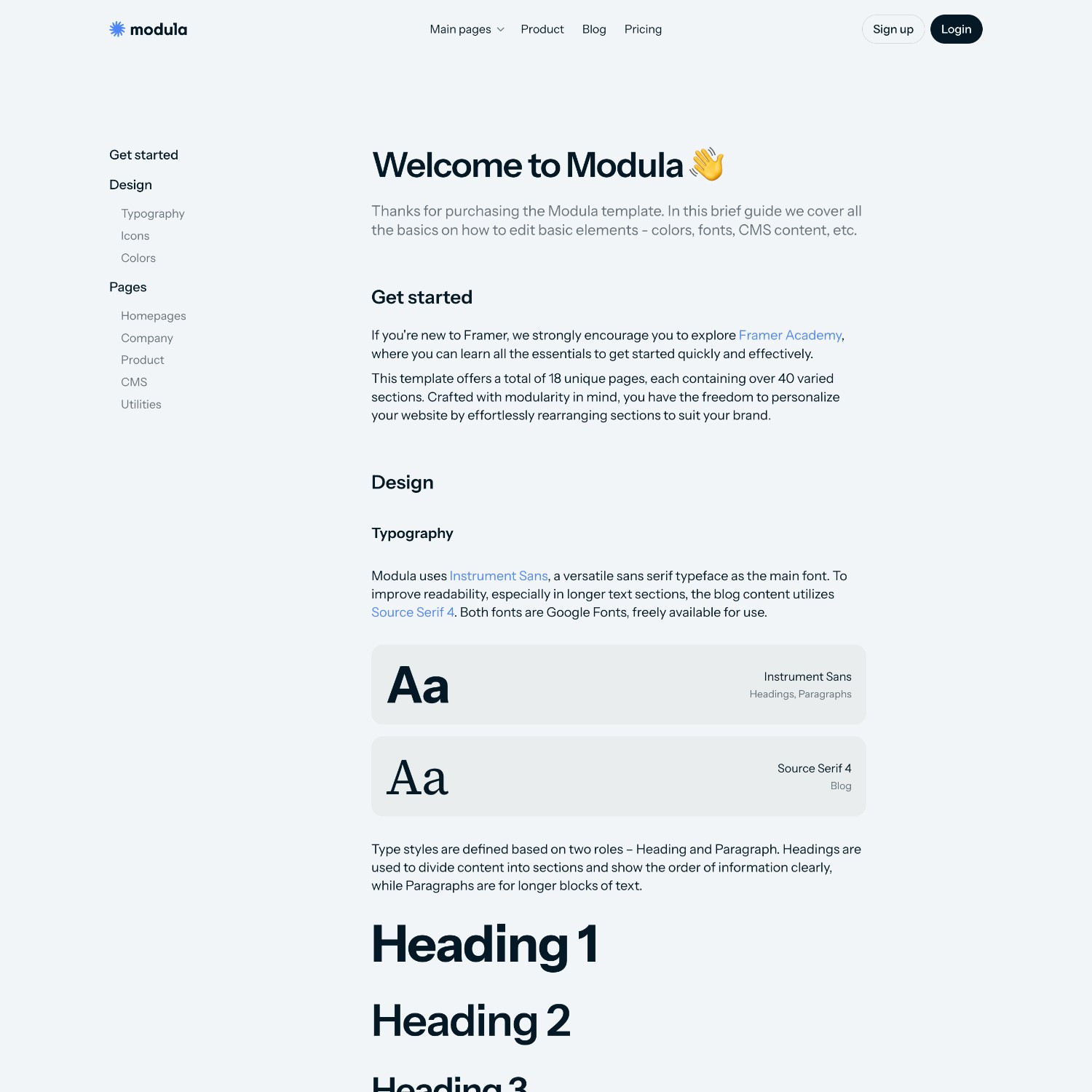
Modula uses Instrument Sans, a versatile sans serif typeface as the main font. The font is from Google Fonts, freely available for use.
Aa
Instrument Sans
Type styles are defined based on two roles – Heading and Paragraph. Headings are used to divide content into sections and show the order of information clearly, while Paragraphs are for longer blocks of text.
Heading 1
Heading 2
Heading 3
Heading 4
Heading 5
Heading 6
X-large paragraph
Lorem ipsum dolor sit amet, consectetur adipiscing elit, sed do eiusmod tempor incididunt ut labore et dolore magna aliqua.
Large paragraph
Lorem ipsum dolor sit amet, consectetur adipiscing elit, sed do eiusmod tempor incididunt ut labore et dolore magna aliqua.
Medium paragraph
Lorem ipsum dolor sit amet, consectetur adipiscing elit, sed do eiusmod tempor incididunt ut labore et dolore magna aliqua.
Small paragraph
Lorem ipsum dolor sit amet, consectetur adipiscing elit, sed do eiusmod tempor incididunt ut labore et dolore magna aliqua.
Icons
The chosen icon family is Phosphor, renowned for its flexibility and extensive variety. You can explore their entire library here, and easily replace icons on the website as needed.
Colors
Modula features 3 colors — primary, secondary, and tertiary which you can customize to match your brand's identity. Additionally, each color offers a variation with 10% opacity, which is utilized for specific highlights. Ensure to update the HEX codes accordingly!
Primary
Secondary
Tertiary
A grey palette is implemented for text and various elements to delineate between primary and secondary content. These tones are meticulously selected to infuse vibrancy into the design, so we don't recommend you to change them.
Black
Grey 1
Grey 2
Grey 3
Border
Off White
Animations
Micro-interactions, those small but impactful moments of user engagement, are vital for any interactive website.
Modula not only incorporates these micro-interactions seamlessly but also offers a plethora of other features to enhance the user experience.
Pages
Modula offers a total of 18 unique pages, containing over 40 different sections. Crafted with modularity in mind, you have the freedom to personalize according your brand needs.


Utilities


CMS
Manage your blog posts with a user-friendly Content Management System that allows you to add, edit, and delete them without the hassle of navigating through the design canvas.
You have the freedom to fully customize: title, date, description, image, tag, minutes read, premium read (yes/no) and content.
Best practises
Editing content
The primary breakpoint corresponds to the desktop size, which is set at 1399 pixels. This implies that editing your content must be done primarily in the desktop view, with the changes cascading to other views accordingly. This is valid for text content, images, effects and specifications.
Learn more about breakpoints here.
Image size
When uploading your images, it's essential to prioritize optimal file specifications. Ideally, the file size should not exceed 500KB to ensure swift loading times and efficient webpage performance.
Furthermore, selecting the appropriate file format is crucial; for most images, JPG is recommended due to its efficient compression without compromising quality. However, if transparency is required, such as for logos or icons, PNG becomes essential.
By adhering to these guidelines, you can enhance the overall user experience and streamline website functionality.
Visual consistency
Maintain consistency in design elements such as colors, fonts, and spacing throughout the template to ensure a cohesive look and feel.
Responsive design
Ensure that your design is responsive and adapts well to various screen sizes and devices. Test your prototype on different devices to verify responsiveness.